
Don’t Turn Web Users Away. Make Your Website Responsive!
 Wikimedia
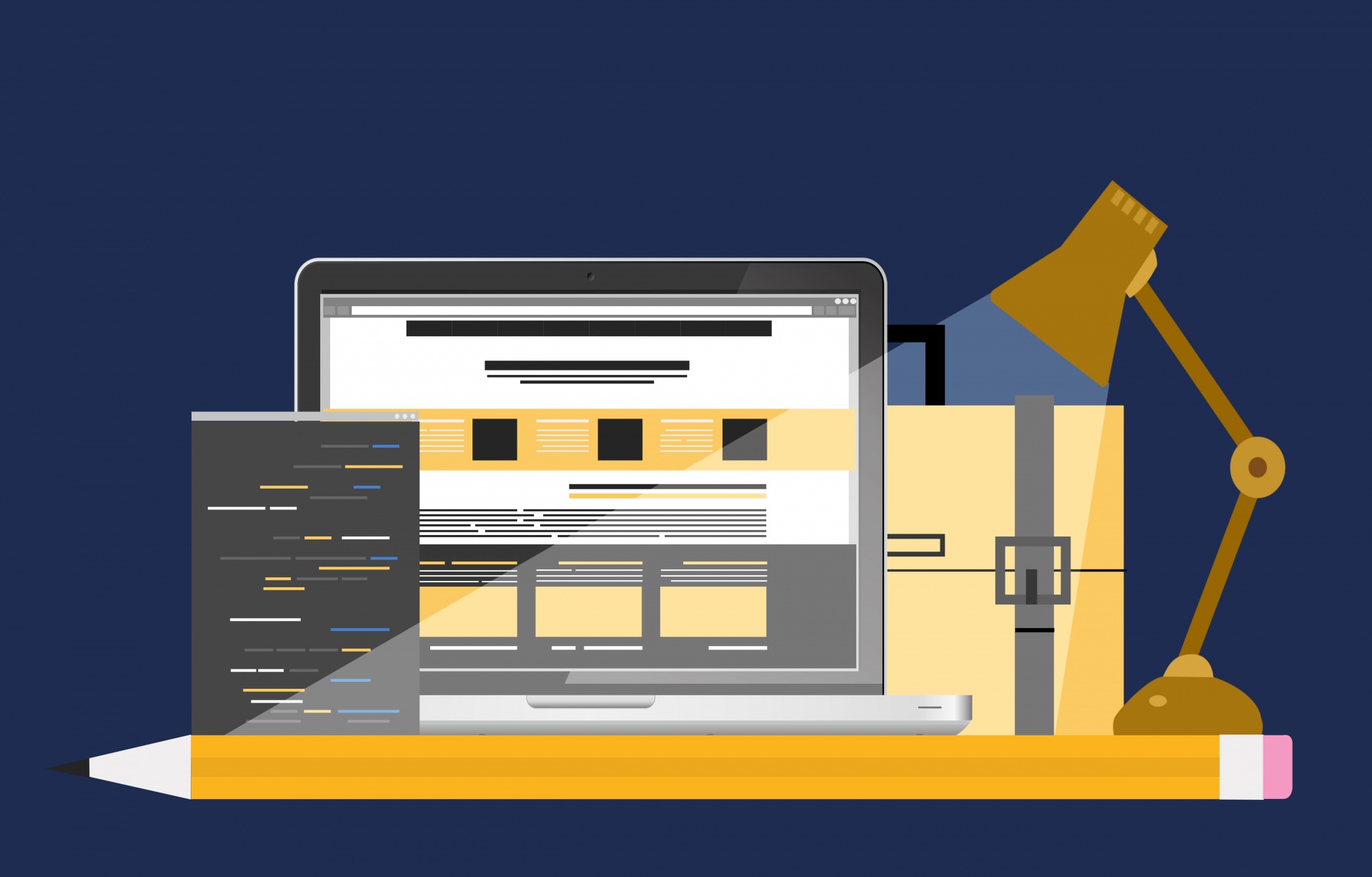
Your website is probably going to be someone’s introduction to your business. So you need to make sure it responds well to a given user. This, of course, requires a focus on responsive web design.
Why your website needs to be responsive
When we talk about responsive web design, we have to consider the technology that most people use to surf the Internet. People are using so many different devices that modern websites have to be more responsive than ever. Your website should be able to respond correctly to being accessed from specific devices. Mobile phones and tablets, of course, are what I’m talking about here.
You have to consider the fact that smartphones and tablets may not be covered through the use of one “mobile” site. Screen sizes on these devices vary so widely that it simply isn’t that easy. The development of your website needs to take this into account. Whether people are accessing your website on a portable device or a traditional computer, it needs to be responsive. Otherwise, you’re probably asking the user to put more effort into viewing your website than they’re willing.
The technical foundations
When you’re building the bones of your website, you need to consider all of these factors. Many business owners make the mistake of building a website without regard to this need to be more responsive to several users. The idea is that, once you have the website built as you imagined it, it can then be altered to be more responsive. But if you’re not considering all of this from the very beginning, you’re just asking for something to go wrong! (At the very least, it’s going to take a lot more time!).

That’s why it’s very important that you work with the website developer. They should have a clear understanding of the need for web design to be responsive. If they’re able to help you out with web and mobile apps too then that’s an even better sign. It’s really better to “get technical” as soon as possible!
Layout and media
When people think about responsive websites, the first thing they think about is probably the layout. After all, this is the website element that usually goes so wrong when there’s a lack of responsive web design! The layout of the website seems to be a big enough problem for business owners who are only focused on traditional web browsers. This actually seems to have become a bigger problem with the introduction of smartphones and tablets. A lot of websites now take cues from mobile design onto their regular website. This is often in an effort to save time when it comes to making a mobile website. But all you do there is frustrate regular desktop web users!

Pixabay
Media is another thing you need to consider. Embedding a video into your website has always been a tricky area when it comes to usability. (Remember the days when web developers basically only used Quicktime Player for video embedding? Not the most user-friendly platform!) These days, it seems much easier with the existence of YouTube and Vimeo. But embedding a video on your homepage could spell havoc for some mobile users. Be careful!
Let us help you improve your bottom line with strategic, nimble and smart marketing and public relations!
[contact-form][contact-field label=’Name’ type=’name’ required=’1’/][contact-field label=’Email’ type=’email’ required=’1’/][contact-field label=’Title’ type=’text’ required=’1’/][contact-field label=’Company Name’ type=’text’ required=’1’/][contact-field label=’Website’ type=’url’ required=’1’/][contact-field label=’Comment’ type=’textarea’ required=’1’/][/contact-form]